05.06.2025 (Week 07)
Lee Xiang Ling / 0384095
Digital Photography and Imaging / Bachelor of Design in Creative Media /
Taylors University
Week 7 — Colour Theory & Poster Design (Part 2)
Lecture
COLOUR THEORY
Colour theory is both a science and an art, explaining how humans perceive color and how it is expressed and communicated artistically and emotionally.
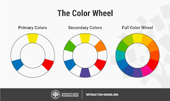

Fig. 1&2 - Colour Wheel
1. RGB vs CMYK
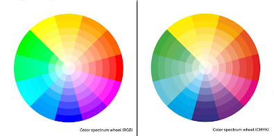 |
| Fig. 3 - RGB vs CMYK |
RBG
- It is used to display on your computer screen
- It is a additive color mixing model. Colour is made by mixing red, green, and blue (RGB) light at different intensities. TVs, screens, and projectors use RGB as primary colours.
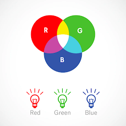 |
| Fig. 4 - The colour of RGB |
CMYK
- Cyan, magenta, yellow and black (CMYK) are the primary colors of printing.
- It is the subtractive color mixing model. Colour is created by subtracting light in the CMYK system, which is used for printing.
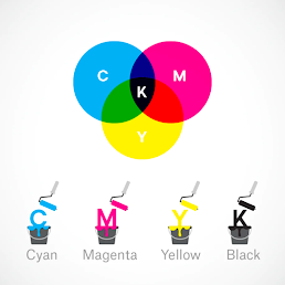 |
| Fig. 5 - The colour of CMYK |
2. Hue, Shade, Tint and Tone
- Hue is the most basic of color terms and denotes an object’s color.
- Shade is a hue to which black has been added. For example, red + black = burgundy.
- Tint is a hue to which white has been added. For example, red + white = pink.
- Tone is a color to which black and white (or grey) have been added.
 |
| Fig. 6 - Example of Hue, Shade, Tint and Tone |
3. Colour Harmony
- The arrangement of the colors in design in the most attractive and effective way for users’ perception.
 |
| Fig. 7 - Example of Colour Harmony |
4. Monochromatic
- It is hard to make a mistake and create the distasteful color scheme.


Fig. 8 - Example of Monochromatic
5. Analogous
- Analogous are 3 colours located right next to each other on the colour wheel.
- Usually one of the three colors predominates.
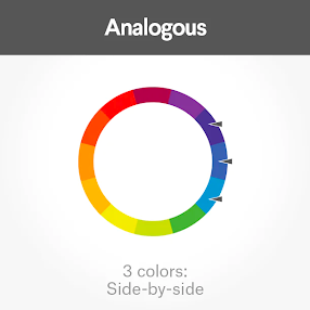

Fig. 9 & 10 - Analogous
6. Complementary
- Complementary colors are opposite on the color wheel and create high contrast, unlike analogous or monochromatic schemes.
- It make imagery pop, but overusing them can get tiresome.
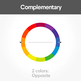

Fig. 11 & 12 - Complementary
7. Split-Complementary
- It involves the use of three colors. Start with one color, find its complement and then use the two colors on either side of it.
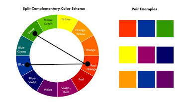

Fig. 13 & 14 - Split Complementary
8. Triadic
- Triadic colors are evenly spaced around the color wheel and tend to be very bright and dynamic.
- Using triadic color scheme creates visual contrast and harmony simultaneously.
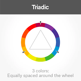

Fig. 15 & 16 - Triadic
9. The Psychology of Colour
- Colors have an extraordinary ability to provoke specific emotions for each individual and to attract people’s attention and harmony simultaneously.
- While perceptions of color are somewhat subjective, some effects have universal meaning.
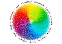
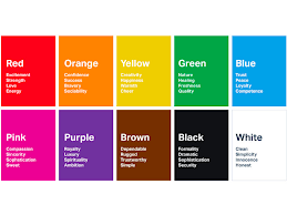
Fig. 17 & 18 - The Psychology of Colour
10. Warm vs Cool
- A line through the center of the color wheel separates warm colors (reds, oranges, yellows) from cool colors (blues, greens, purples).
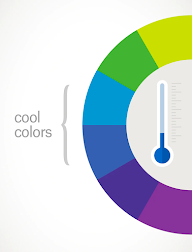

Fig. 19 & 20 - Warm and Cool
Warm
- Warm colors often evoke happiness, optimism, and energy. They can also grab attention and signal danger or action, like stop signs and hazard warnings. (Red, Yellow & Orange, etc.)
 |
Fig. 21 - Warm |
Cool
- Cool colors are calming and soothing but can also express sadness. (Blue, Green, etc.)
- Purple, a mix of blue and red, often sparks creativity.
 |
| Fig. 22 - Cool |
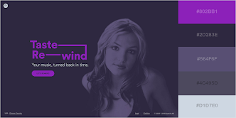 |
| Fig. 23 - Example of purple |
11. Black & White
- Black is often used sparingly, like for text, but can work well as a primary element, such as backgrounds. It adds sophistication, elegance, mystery, and bold confidence.
- As a primary color, white conveys cleanliness, virtue, and health. It pairs well with almost anything, making it ideal as a secondary color.

Fig. 24 & 25 - Example of Black & White
Instruction
<iframe allow="autoplay" height="480"
src="https://drive.google.com/file/d/1DsERWuF4d2YDYxX0lRiZOdmNqf8wk4FU/preview"
width="640"></iframe>
Reflection
After taking this lecture, I finally understood why the colors in my illustrations always look different on various devices. Although I had previously learned some basic color theory, I never truly grasped the differences between digital and print color systems. It was only now that I realized electronic devices use color models like RGB, while printed materials rely on CMYK, and these systems are fundamentally different. This discovery deepened my understanding of color application and made me aware that design work requires color adjustments depending on the output medium to ensure consistent visual results across platforms. This course not only filled a gap in my knowledge but also improved my ability to make professional decisions in practical design work.